
)
The Golden Ratio is a beautifully simple piece of mathematical theory that can help make your designs feel well proportioned and pleasing on the eye.
Based on the Fibonacci Sequence (which you may remember from Dan Brown's novel The Da Vinci Code), the Golden Ratio (1:1.618) describes the relationship between two proportions. This ratio forms such a common sight in nature, and it feels pleasing to the eye when we use it in our design work.
It has been used since the early Renaissance period when new age art concepts exploded onto the scene. Many artists and architects have proportioned their works to approximate the Golden Ratio especially in the form of the golden rectangle, in which the ratio of the longer side to the shorter is the Golden Ratio believing this proportion to be aesthetically pleasing.It's believed that the Golden Ratio has been in use for at least 4,000 years in human art and design, but it may be even longer than that some people argue that the Ancient Egyptians used the principle to build the pyramids. In more contemporary times, the Golden Ratio can be observed in music, art, and design all around you.
Very closely related to the Golden Ratio is the 'Rule of Thirds'. If you're familiar with this idea you'll know that it's formed by dividing an area into equal thirds both vertically and horizontally. The intersection of the lines will provide a natural focal point for the shape.Photographers are taught to position their key subject on one of these intersecting lines to achieve a pleasing composition, and the same principle can be applied to graphic design.
Although the rule of thirds can be applied to any shape, if you apply it to a rectangle with proportions approximately 1:1.6, you get very close to a Golden Rectangle, which makes the composition all the more pleasing to the eye.Try experimenting with one of these design rules in your page layouts, web mockups, brochure and poster designs.
| Posted in:Logo DesignGraphic Design |
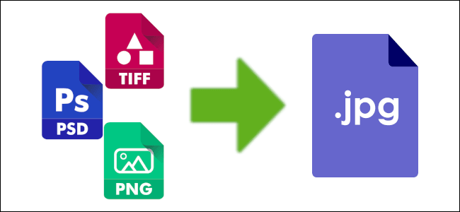)
With the explosion of scanners, digital cameras and the internet, the JPEG image format has quickly become the most widely used digital image format. It's also the most misunderstood. Here's a few common misconceptions and facts about JPEG images.
JPEGs lose quality every time they are opened and/or saved.
False. Simply opening or displaying a JPEG image does not harm the image in any way, but some image editors do recompress JPEGs when the 'Save As' command is used. To avoid more loss you should duplicate and rename JPEGs in a file manager rather than using 'Save As JPEG' in an editing program.
JPEGs lose quality every time they are opened, edited and saved.
True. If a JPEG image is opened, edited, and saved again it results in additional image degradation. It is very important to minimize the number of editing sessions between the initial and final version of a JPEG image.
JPEG is an all-purpose format suitable for just about any image.
False. JPEG is best suited for large photographic images where file size is the most important consideration, such as images for the internet or email. JPEG is not suitable for most small images under a few hundred pixels in dimension, and it is not suitable for screen shots, images with text, images with sharp lines and large blocks of color, and images that will be edited repeatedly.
JPEG is ideal for long-term image archival.
False. JPEG should only be used for archiving when disk space is the paramount. Always keep a master copy of any image you expect to edit again in the future.
JPEG images don't support transparency.
True. You may think you've seen JPEGs with transparency on the web, but in fact the image was created with the intended background incorporated into the JPEG in such a way that it appears seamless on a web page with the same background. This works best when the background is a subtle texture where seams are indistinguishable.
| Posted in:ComputersPhotography |
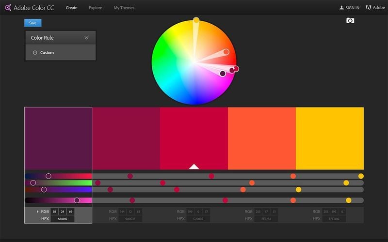)
One of my secret weapons in the sourcing of new colour combinations for my clients is Adobe Color.
I have been using the Adobe Color (formerly Kuler) website for years and now Adobe has an iPhone app that will helps capture and share any shade of the rainbow.As with the website, you can try out, create, share and save various colour schemes, each of which consists of a set of five colours using a series of slides and colour wheels.
You can use it for creating new hues in one of seven colour rules analogous by default, but monochromatic, complementary, and others are also available.The website is fun and handy, where you can create your own or scroll through heaps of colour combinations submitted by other designers, but the app has an extra powerful tool. It allows designers to build and edit colour themes based on photos taken with their iPhone.
While aiming the iPhone, five on-screen dots continually sample colors from any objects within its field of view, displaying them as a theme. Tapping the screen freezes the current theme so it's not lost during capture.Thanks to Adobe Color, capturing any colour of the rainbow is not just fun, but also free, and it's sure to become a valued mobile tool for creative designers everywhere, and for anyone who loves playing with colours. Adobe Color is exceptionally cool! (or should that be 'kule'?) See color.adobe.com/explore
| Posted in:Logo DesignGraphic Design |
)
Sending large photos and files via email can prove a challenge, as most email programs limit the amount of megabites you can send and receive at one time. Here are a two different ways to send photos through your email and start sharing your memories with clients, friends and family in a matter of minutes. Firstly, you could reduce the size of your images but you will lose quality and the photos may pixelate. The second option is to use a third party website.
It would help if you knew the requirements of the people that you are sending the images to. For example, a website developer might not need a high resolution file, so you could downsize them before sending. But if you are sending photos to be printed in a large format (e.g. to a relative to print onto a canvas) you will need to send the largest file possible. Just make sure you ask what they need first.
1. Reduce the size: There are two main ways to reduce the file size. One is to resize the image (reduce the number of pixels). The other is to compress/zip the file (right-click the file icon on most machines).
You shouldn't lose quality when downsizing (although your images will be smaller) but you can lose quality when compressing the image. And jpeg files are already compressed so you won't save too much memory by zipping them.
Compressed files are good if your recipients just want to view them, but if they want something to print it's probably best not to shrink or compress the image.
It also depends on the number of images that you are sending. If it's only a few, send one at a time. But if there lots of images, it might be better to use a third party website.
2. Third Party Website: Some of these include wetransfer.com and hightail.com (formerly yousendit.com) where you can sign up (for free) and 'email' your files. If you have a free account and you want to send multiple files you will need to 'zip' them into a single file. (Put them into a folder and zip the folder). Another great option is dropbox.com. This handy little website lets you share a folder on your computer with anyone you invite via their email address. And it's free!
| Posted in:ComputersEmails |
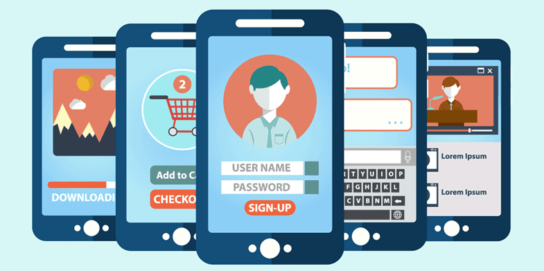)
Mobile web design is different to its desktop brother. Even though you might have a website, it may not be friendly for your visitors who are using their smart phones when they're on the road, or want to fill their free time. Going mobile with your website is about function and speed, rather than pixel-perfection.
As more and more people have access to the internet on the go, it pays to tailor your site with mobile devices in mind. In fact, the statistics show that if the trend continues, in the future more people will be viewing your website via a mobile device than desktop or laptops.
The best mobile sites are elegant and clean. Investigate what people visiting your mobile friendly website actually want to see ask clients what's really important to them and consider what information users will want to access quickly, such as reservation information, menus and location maps on a restaurant website.
People who use the internet on the go are typically looking for specific information and they want it quickly. They want to know how to find you (get your mobile website to interact with their phones GPS), be able to easily call you (again with one click and the phone rings), and search your website and browse the menu. To achieve this, your mobile website needs to be different to your normal desktop website.
Sites with articles that regularly get shared should try to keep their work intact for those with smaller devices, but for most other businesses it pays to trim content. The attention span of users on a phone is shorter than for computer users, so it's worth getting to the main points quicker.
...but
Most users expect an equal and continuous journey across devices, so there is a strong argument that your mobile website should be a reflection of your desktop version.
Ideally your mobile website should be able to be managed through the same Content Management System (CMS) as your desktop website, with the option to use the same content or change certain pages to adjust to the different medium.
People will click the 'desktop version' link, particularly when served with a very limited mobile website, or a site that is substantially different structurally or visually to what they are used to, so try to keep the core content the same. Keep in mind how the user will move from one device to another and what that should mean for their experience.
As discussed, there are instances when someone will need access to your full site, so include a 'desktop version' link at the bottom of each page.
To make your site performs well on a phone there are a number of technical considerations. The first is that your site should automatically recognise when a mobile phone is being used to access it so the user can be redirected to a mobile version. You also need to think about elements like screen resolution, making buttons and links bigger than normal and removing some features, such as Flash, that do not work on most smartphones.
?Knowing what type of device people are viewing your mobile website on is key for guiding the design process and your mobile website strategy. Though many people have smartphones, don't assume that everyone does, or that they all have an iPhone or Android phone. Instead look into what devices your target audience actually are using with the help of analytics or research.
And while you do need to be mindful of the fact that not everyone is using the same device, don't get too hung up about it. The technology used on different mobile devices is fairly similar. Just remember that not everyone has the same screen resolution or input and your site will look different on different devices.
With all the different platforms out there, it's practically impossible to test on every possible combination of smartphone and operating system; new devices ship almost weekly, not to mention operating systems! But it is important to test across a general cross-section of devices, and you should aim to make this an ongoing process.
There's nothing worse than designing for iOS alone, then discovering at the end of your build that Android devices won't render your page as intended.
Another thing to consider is how your target audience use their phone, as well as if they have a reliable internet connection. The latter is particularly important if, for example, your users will fill in forms on their mobile devices.
There are a range of misconceptions regarding mobile website usage that can lead to misleading design decisions. One of the most common ones are how mobile users are always rushed and on the go, or that they're only interested in certain things when they use their mobile phones.
In fact, a big portion of mobile website usage happens when we have time to kill or when we're at home on the couch, and that impacts how you should approach things. It's better to base your design decisions on the theory that phones are used increasingly for the same tasks as a desktop, as this is actually what's already happening. But as much possible do research into the specifics for your target audience to understand what's true for them.
Limitations with your current website, like a lack of CMS, may make building a bespoke mobile website necessary, but if possible try to avoid building separate sites. In the long run these will be more costly and time consuming to maintain as it means doing changes twice.
Building something which works on as many devices as possible will provide you with the best setup for focusing your resources and budget on the content rather than maintenance.
Try to learn to use a device from a user's point of view. Test your design on that device and ask your clients to test it too, so you can see if there's any information that shouldn't be there or if anything's missing. User testing is always really important as well.
Accept and embrace the limitations. It's tempting to try to cram every last bit of functionality into a mobile-orientated website, but you need to accept that some things are better suited to desktop machines than portable devices. Conversely, mobile devices are far better at some things than desktops. Location-aware content, for example, is an ideal application for mobile.
Every image that gets added needs to get downloaded by the user. Because performance is so important on the mobile web, make sure the images you include are relevant to the user and will help them achieve their goals.
Interacting with the web through touch requires care and attention. You can't count on the precision of a cursor and instead need to accommodate for people's fat fingers. Make sure buttons, forms and other elements are large enough to interact with without fear of accidentally tapping/swiping on an adjacent element.
Mobile internet access is now a huge part of your customer's everyday life. As such, any business with an online presence should think carefully about having a thumb friendly mobile website for their business.
| Posted in:Websites |
PHONE0400 270 806
ADDRESS56 Fourth Street, Home Hill,
Queensland, Australia, 4806
POSTAL ADDRESSPO Box 32, Ayr, Queensland,
Australia, 4807
)
| Posted in:Logo DesignGraphic Design |
)
| Posted in:ComputersPhotography |
)
| Posted in:Logo DesignGraphic Design |