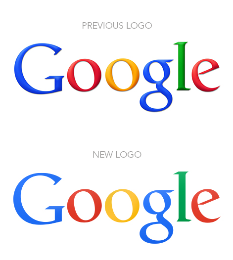

Keeping inline with the new 'flat is cool' design trend, Google finally released an update to their logo along with a cleaner home page for most users.
It's new flattened logo is cleaner, which is a much needed attribute when using a serif typeface and many colors.
The shadows and bevelling have been removed from the primary coloured lettering of the logo for a flatter appearance, while the colours are slightly more muted to give a more modern look.
Here's an excerpt from an interesting blog I read on this new trend of flat design:
The term "Flat Design" gets its origins from the fact that it removes most if not all traces of drop-shadows, flashy gradients and extraneous textures from the visual design. Everything looks "flat", rather than beveled, bulged, clickable, or inset.
On one hand this is a good thing, because it forces designers to focus on the content as the most central part of our design. It forces us to think about how to present the content in such a simple and compelling way that really gets to the heart of the issues and needs of our users.
Where it can turn ugly is when a designer takes this style to an extreme and removes all user-guides and suggestions from an element. You can see this on some websites where it's hard to tell what is a button, or a clickable link.The worst example would be a button to buy a product, except there's no way to tell it's a button unless you actually start clicking around. When you hover or "press" the button, nothing happens there is no visual indication that something is happening or will happen in response to your action.
This is very frustrating to users it's just all around bad usability.
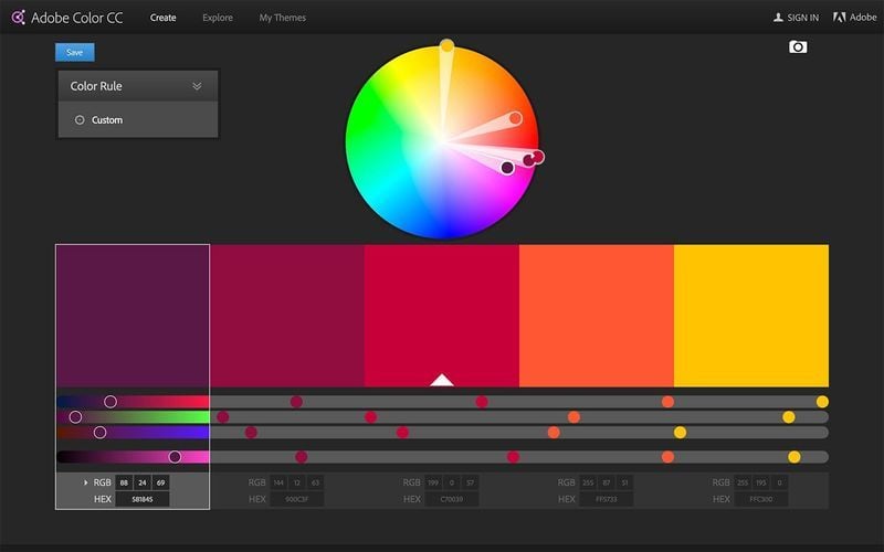
Another important aspect of the Flat Design style is a strong focus on color. Rather than limiting colors to the long-overused tones of "business blue" and "metallic chrome", designers are experimenting with newer shades like web green, peachy red, and lilac purple.
As you know, colors are very powerful, and can mean the difference between an engaging design and something that offends or puts off your users.The one thing to remember here is to not use a color just because you see it on another "cool" site. You really need to think about the company or product you are designing for, and what their message is.
So don't simply grab the hex value of the latest and greatest "web green" design and plug it into your design. Do some research, find out what you want to portray with your visual design and then choose your colors accordingly.Your color guide should be a lot different if you are working with say JCP or Vogue verses a large construction or demolition firm.
Good typography is a key foundation of Flat Design. Because you have stripped away all the extra visual "fluff and shine", there is a lot of room for really good typography to shine.
Webfonts have been around for several years, but we are only beginning to scratch the surface of what can be accomplished with them. More and more web designers are beginning to look to print for typographic inspiration. Web typography is getting better, but we still have a long way to go.
Typography is one of those things that when done well really exemplifies the message of the site. Instead of drawing attention to the fonts, you are drawn to the content and purpose of the article or app.The disturbing fact about many websites is that good typography is often undervalued and tacked-on after the fact. Designers and clients alike have not given much attention to typography and taken advantage of its power.
In order to effectively communicate your message, as much time and effort must be spent on the typography as you spend on picking colors, and pushing-pixels to get things looking just right.
You can read the whole blog by Caleb Mellas here.
) Author:Kellie Williams
Author:Kellie Williams| Tags:Logo Design |
PHONE0400 270 806
ADDRESS56 Fourth Street, Home Hill,
Queensland, Australia, 4806
POSTAL ADDRESSPO Box 32, Ayr, Queensland,
Australia, 4807
)
| Posted in:Logo DesignGraphic Design |
)
| Posted in:ComputersPhotography |
)
| Posted in:Logo DesignGraphic Design |